DESIGN SYSTEM · v1.0
A single source of truth for the tokens, components, and patterns behind the Lefeld template. Each board below documents how a piece of the system looks, the states it supports, and when to use it.
Version 1.0
Updated Jul 2026
34 boards
FOUNDATIONS
Typography
The type scale is built on Geist. Each style is a saved text preset used across the site, keeping headings, body copy, and labels consistent.
Display
72 / 600
Elevate every space
H1
48 / 600
Craftsmanship in every detail
H2
34 / 600
Designed to last a lifetime
H3
24 / 500
Gunite pools & spas
H4
20 / 500
Outdoor living, reimagined
Body Large
18 / 400
Body large is used for intros and lead paragraphs across the site.
Body
16 / 500
Body copy is the workhorse style for descriptions and supporting text.
Caption
14 / 400
Captions annotate images, meta, and fine print.
Eyebrow
13 / 500 · TRACKED
SECTION LABEL
FOUNDATIONS
Color System
Colors are stored as tokens so themes stay consistent. Brand tones lead, neutrals structure the page, and semantic colors signal state.
Brand
Casal
rgb(46, 107, 113)
Driftwood
rgb(182, 138, 78)
Aztec
rgb(14, 26, 34)
Mystic
rgb(220, 234, 234)
Semantic
Accent/Primary
rgb(46, 107, 113)
Text/Primary
rgb(14, 26, 34)
Text/Secondary
rgb(74, 98, 112)
Border/Default
rgb(197, 216, 217)
State/Success
rgb(46, 125, 74)
State/Error
rgb(192, 57, 43)
Neutrals
Neutral 50
rgb(255,255,255)
Neutral 100
rgb(242,242,242)
Neutral 300
rgb(200,200,200)
Neutral 500
rgb(136,136,136)
Neutral 700
rgb(72,72,72)
Neutral 900
rgb(0,0,0)
FOUNDATIONS
Spacing Scale
Spacing follows a consistent step scale used for gaps and padding. Reusing these values keeps rhythm predictable across sections and components.
4px
8px
12px
16px
24px
32px
48px
64px
96px
FOUNDATIONS
Grid System
Layouts sit on a 12-column grid inside a 1040px content column with 64px gutters. Components snap to column spans for predictable, responsive composition.
12 columns · 16px gutter
Responsive card grid
Spans 1 of 3
Spans 1 of 3
Spans 1 of 3
FOUNDATIONS
Corner Radius
Rounding scales with element size so radii stay concentric. Small controls use tighter corners; cards and surfaces round more; pills use a full radius.
Subtle
6px
Control
10px
Card
16px
Large
24px
Pill
100px
FOUNDATIONS
Elevation & Shadows
Elevation communicates hierarchy. Resting surfaces sit flat with a hairline border; raised cards and floating overlays add progressively softer, deeper shadows.
Flat
Hairline border only
Raised
0 1 2 · 0 4 12
Floating
0 8 24
Overlay
0 16 48
COMPONENTS
Buttons
One Button component powers every call to action. Variants change emphasis while padding, radius, and label typography stay consistent. Hover and press feedback are built in.
Use one Primary action per view. Pair it with a lower-emphasis Secondary or Outline button for supporting actions.
COMPONENTS
Inputs
Text inputs share a single style: a soft surface, hairline border, and 10px radius. Focus brings an accent border; errors turn the border red; disabled inputs dim to 50%.
Default
With value
Error
Disabled
COMPONENTS
Text Areas
Multi-line inputs reuse the input surface with more height and a resize handle. Used for project details, messages, and notes in contact forms.
Resizable vertically. Keep a generous minimum height so multi-line answers are comfortable to write.
COMPONENTS
Dropdowns
Select menus match the input surface so forms stay visually unified. Use them for a known, finite set of choices such as project type or budget range.
COMPONENTS
Checkboxes
Checkboxes allow multiple selections from a list. The box uses a subtle border at rest and fills with the accent color when checked.
COMPONENTS
Radio Buttons
Radios select exactly one option from a group. Sharing a group name ensures only a single choice can be active at a time.
COMPONENTS
Switches
Switches toggle a single setting on or off with immediate effect. The track fills with the accent color when on and the thumb slides to the active side.
On
Off
COMPONENTS
Tabs
Tabs switch between related panels in place without leaving the page. The active tab is marked with an accent underline; click a tab to reveal its panel.
Design
Build
Maintain
Design phase
We start with your site, budget, and vision, then produce 3D renderings and material selections before any ground is broken.
COMPONENTS
Accordions
Accordions progressively disclose content, keeping long pages scannable. Clicking a row toggles it open or closed with a smooth height animation.
How long does a build take?
Most custom pools take 8–12 weeks from groundbreaking to first swim, depending on scope and weather.
Do you handle permits?
COMPONENTS
Navigation
The site navigation is a shared component applied through the layout template. It carries the logo, primary links, and a call to action, with responsive variants for each breakpoint.
Navigation lives in the Site Layout template, so every page inherits the same header. Switch its variant per breakpoint rather than duplicating the bar.
COMPONENTS
Cards
Cards group related content on a consistent surface: a white fill, hairline border, and 16px radius. Vary the content — icon, media, or highlight — while keeping the frame identical.
Icon card
Lead with an icon to signal a feature, service, or value at a glance.
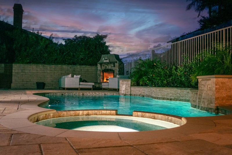
Media card
Pair a full-width image with a short caption for projects and galleries.
COMPONENTS
Statistics
Stat items surface proof points — years, projects, ratings — in a compact icon-and-number pairing. Group them in a row to build credibility quickly.
15+ YEARS
Experience
500+
Pools Built
4.9 STARS
Client Rating
100%
Satisfaction
COMPONENTS
Service Cards
Service items present each offering with an icon and label. Arrange them in a responsive grid so the list adapts from four columns down to one.
Outdoor Living
Custom Pools
Integrated Spas
Fire Features
Landscape Design
Renovations
COMPONENTS
Project Cards
Project cards showcase completed work. The featured card leads a section with a large hero and description, while standard cards form a browsable grid with title and location.
FEATURED PROJECT
Franklin Estate Retreat
Luxury gunite pool with infinity edge, integrated spa, fire bowls and limestone decking.

COMPONENTS
Gallery Components
Galleries present a set of images in a responsive grid with consistent radius and spacing. Click any image to open it in a full-screen lightbox.


COMPONENTS
Testimonials
The testimonial slider rotates through client reviews with a portrait, quote, and attribution. Use it to add social proof near the end of a page.

COMPONENTS
FAQs
Frequently asked questions use the accordion component in a single column. Keep answers concise and lead with the questions clients ask most.
How much does a custom pool cost?
Most projects range from $80k to $250k depending on size, materials, and features. You get a detailed quote after the design consult.
How long is the typical build?
Do you offer financing?
What maintenance do you provide?
COMPONENTS
Call to Action
CTA bands convert. A dark surface, a confident headline, and a primary/secondary button pair focus attention on the single next step.
GET STARTED
Ready to design your backyard?
Book a free consult and get a 3D rendering of your custom pool within a week.
COMPONENTS
Badges
Badges label status and categories in a compact pill. Neutral for tags, accent for emphasis, and semantic colors for success and error states.
Neutral
Accent
Solid
Success
Error
Outline
COMPONENTS
Icons
Icons come from three sets: Lucide for UI, Phosphor for detail, and Logos for brand marks. Keep stroke weight and size consistent within a context.
Waves
Sun
Droplet
Leaf
Ruler
Sparkles
Wrench
Flame
PATTERNS
Loading States
While content loads, show intent. A spinner covers brief waits; skeleton placeholders preserve layout for content-heavy areas so the page doesn’t jump.
Loading…
Match skeleton shapes to the real content they replace so the layout stays stable when data arrives.
PATTERNS
Empty States
When there’s nothing to show, guide the next action. An empty state pairs a calm illustration or icon with a short message and a single clear button.
No projects yet
Your saved projects will appear here. Start by adding your first design.
GUIDELINES
Responsive Rules
Every page is built across three breakpoints. Layouts reflow from multi-column grids to single-column stacks, and type scales down as the viewport narrows.
Desktop
≥ 1200px
Full multi-column grids, largest type scale, side-by-side layouts.
Tablet
810–1199px
Grids collapse to two columns, spacing tightens, type steps down.
Phone
≤ 809px
Single-column stacks, drawer navigation, smallest type scale.
COMPONENTS
Before / After Slider
A draggable reveal that wipes between two images. Perfect for showing a backyard transformation — drag the handle to compare the empty lot with the finished pool.


GUIDELINES
Accessibility
Accessibility is built in, not bolted on. These baseline checks keep the site usable for everyone across input methods and abilities.
Color contrast
Text meets WCAG AA against its background.
Visible focus
Interactive elements show a clear focus state.
Semantic HTML
Sections, headings, and buttons use correct tags.
Descriptive alt text
Every meaningful image has an alt description.
Touch targets
Tap targets are at least 44×44px on mobile.
Reduced motion
Animations respect the reduce-motion setting.
GUIDELINES
Motion Guidelines
Motion is subtle and purposeful. A shared spring drives most transitions; hover and appear effects add life without distracting from content.
Spring · 0.4s
Default transition
Used for variant changes and layout shifts for a natural feel.
Opacity / lift
Hover feedback
Buttons and cards respond instantly to pointer with a light shift.
Fade + rise
Appear on scroll
Sections ease in as they enter the viewport, once, not on loop.
Hover me
Live: hover for the lift + scale feedback.
GUIDELINES
Page Templates
Pages are assembled from these boards using a shared layout template for the navigation and footer. Common page types combine the sections below in predictable ways.
Home
Intro · Services · Projects · Testimonials · CTA
Projects
Intro · Featured · Gallery · CTA
Services
Intro · Service cards · Process · FAQ
Contact
Intro · Form · Map · Footer